PEMPro Case Study of a Meade RCX-400's Periodic Error (Feb. 20, 2006)

Contents
The data and analysis below is from Doc Greiner's RCX400, which was operated by Greg Sellek. Greg acquired most of the raw data analyzed. In this article I will go through the steps of refining the PEC and come to an interesting conclusion.
First, here is the raw data periodic error data collected by Greg Sellek for the RCX400 on February 17th, 2006. It is important to make sure that when the data is acquired that the mount has been synchronized with a High Accuracy Sync.
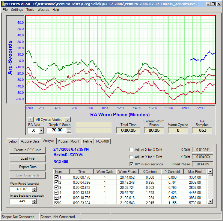
The data is pretty rough because of seeing and wind that was present that night. There is also substantial drift in Right Ascension which may be the result of mis-polar alignment, an imperfect tracking rate, or mount/OTA flexure. The data however is good enough to create a PEC curve.
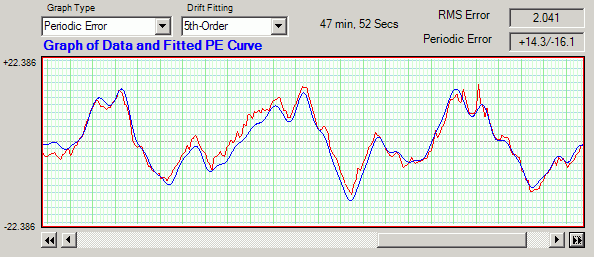
Here is the data in the Create PE Curve window (accessed by pressing Create a PE Curve). The original data is graphed in red and the proposed fitted curve is in blue:
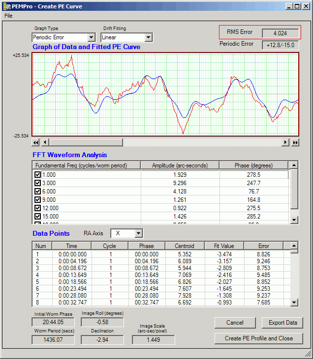
The first thing to look at is the RMS Error in the upper right of the dialog. I enclosed the field with a red box in the above picture. This is the measure of the error fitting the drift and fundamental frequencies. The lower this number the better the fit to the data.
A RMS error of 4.024 is rather high so the curve fit is probably not optimal. High RMS error can also be caused by things such as very bad seeing, rough drive train gears, and imperfections on the worm wheel itself.
But we can try to lower the RMS Error in two ways:
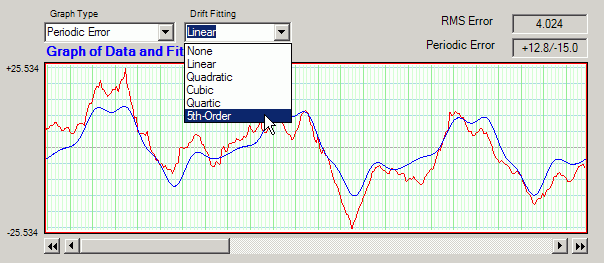
1. Increase the drift fitting order.
2. Configuring the fundamental frequencies.
Increasing the drift order makes sense in this case because the blue curve does not exactly line up on top of the red data curve. I changed the drift order to 5th-Order to see if I could drop the RMS error a bit.
Here is the result:
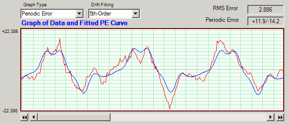
The RMS error dropped dramatically, which is good!
Now let's look at the Frequency Spectrum to see if we have the right fundamentals configured. To view the frequency spectrum change the graph type to Frequency Spectrum.
This will display the frequency spectrum of periodic error fundamentals. The labeled numbers on the top of the graph are multiples of the fundamental frequency. That is a value of "8" would be the fundamental frequency that repeats 8 times across the periodic error graph. Since the graph's width is about 24 minutes, the value at "8" would represent a periodic waveform that happens once about every 3 minutes (and thus 8 times in 24 minutes). Finding these repeating fundamentals helps you understand your mount and allows PEMPro to remove them.
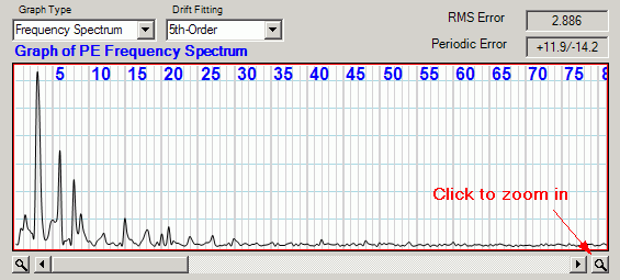
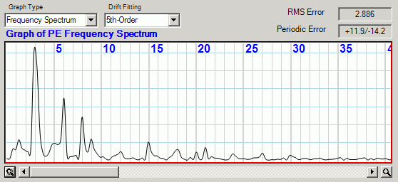
Click the magnifying glass button to the lower right of the graph to get a better look at the interesting fundamentals.
Looking at the peaks you can see that the biggest fundamental frequencies occur at 3, 5, 6, 8, 9, 12, 15, 18, 20, 21, 24, 27, and 30. Note that most of these fundamentals are multiples of three because the Meade PEC mechanism uses 3 worm cycles instead of the normal 1 cycle found in other mounts. The reason for doing this is that the 8th fundamental is usually significant and cannot be corrected with a single cycle of PEC data (because it repeats 2 2/3 times in a single worm period, and is thus not periodic over only one cycle, but over three cycles it will repeat exactly 8 times).
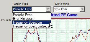
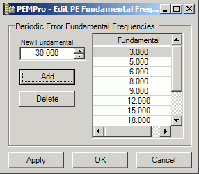
Now let's edit the fundamentals that PEMPro uses:
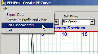
Clicking on Edit Fundamentals brings up the dialog to configure fundamentals:
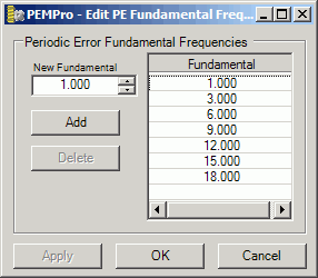
I edited the list of frequencies to match the peaks noted above. Notice that that all important 8th order fundamental was missing!
Clicking OK applied the changes in the fundamentals. Back in the Create PE Curve dialog I selected the Periodic Error graph type. The RMS is now down to 2.041 arc-seconds and the graph matches more closely to the curve.
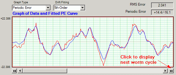
Since there were 3 cycles of original PEC data you can view the other cycles by pressing the double arrow button noted above. Each click moves the graphed data over exactly one graph cycle. Here are the other two cycles:
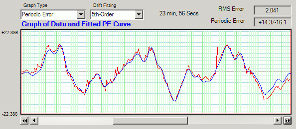
As you can see the created curve matches very well. There is still a little residual drift left over, probably from tiny imperfections in the worm gear. In any case it is a close match to the periodic error. Note that there are a couple random spikes in the data that would probably have been a disaster if they were recorded via an autoguider. Even averaging several cycles would not fully fix this type of error.
Creating and using the PEC curve
The next step is to create a PEC curve and program the mount. After pressing the Create PE Profile and Close button the curve is automatically loaded into the RCX400 tab of PEMPro. Also created behind the scenes is a special PEC file which can later be reloaded for later refinement. It has the same name of the file it was created from except it has the file extension ".ppc". I will use this file later when refining the PEC curve.
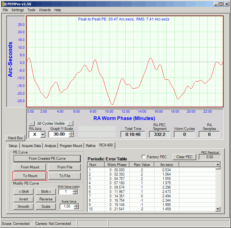
To upload to the mount click the To Mount button. which is marked with a red rectangle above.
Refining the Periodic Error Correction Curve
After loading the mount with the above curve Greg Sellek went through the above steps again with PEC on and provided me with the raw data. From that data I created a second PE curve. That is, one with PEC on.
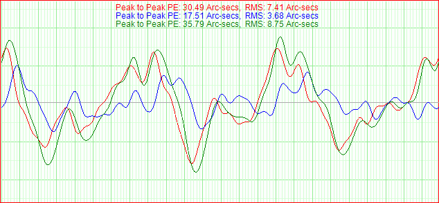
A comparison of the two curves is shown below in the Refine tab of PEMPro. Using the Curve 1 button I loaded the original uncorrected PEC curve (red curve). Using the Curve 2 button I loaded the curve with PEC on (blue curve). As you can see the blue curve is only about a 50% reduction in PE. Not too good!
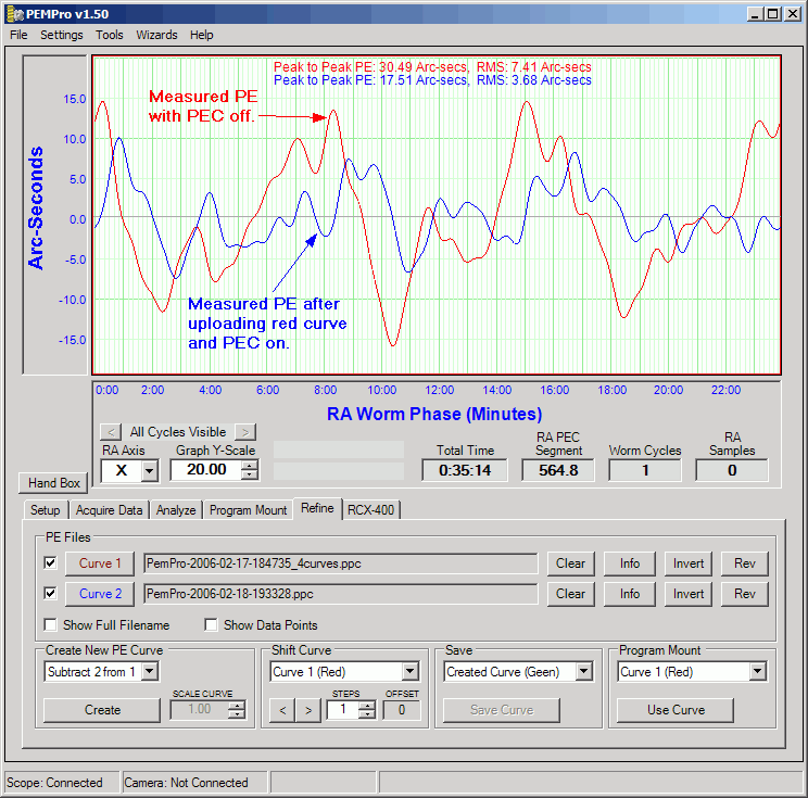
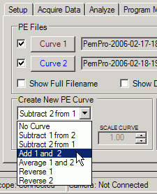
So, under the assumption that any residual periodic error can be added back into the original PEC curve to make a better correction curve I used the Create New PE Curve feature and added the "before PEC" and "after PEC" curves to get a new curve. The new curve is called a Refined curve.
After pressing the Create button I have the Refined (green) curve below:
After saving this curve with the Save Curve button, I clicked Use Curve to load it into the Program Mount graph:
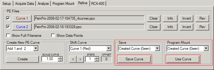
Then clicking to the RCX-400 tab I can now load the curve into the graph there by pressing From Created PE Curve, which is marked in the picture below:
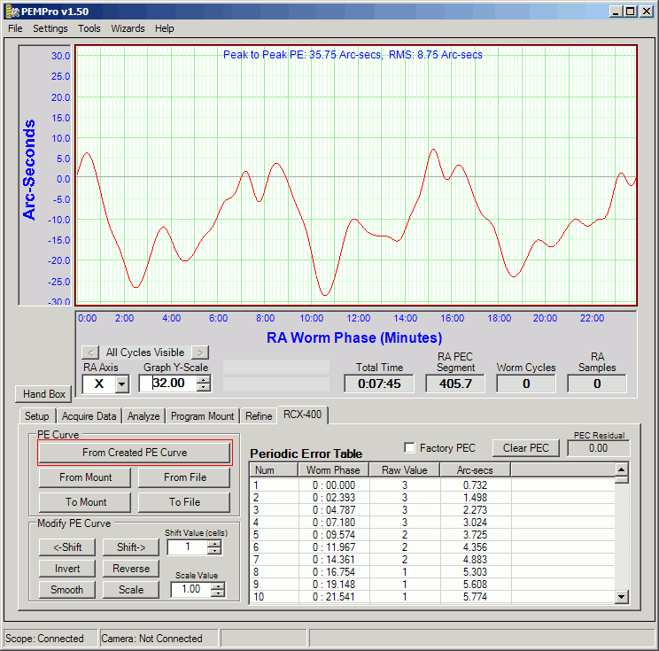
Once again Greg Sellek loaded this curve and provided another raw data file from which came this result:
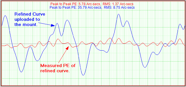
Now this is a really good result! Less than 6 arc-seconds total of periodic error!
All that is remaining is a residual 18th order fundamental which could be further reduced with one more refinement.
Why did the first curve only reduce Periodic Error by 50%?
The mediocre performance of the first curve puzzled me until I looked at the original data and the refined curve on the same graph:
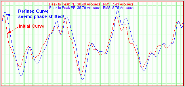
The refined curve seems phase shifted about 10 seconds and is slightly scaled compared to the original data Greg Sellek collected with PEC off. If this is true if the original RCX data that Greg used can be salvaged if it is shifted to the right by about 10-12 seconds (4-5 cells) and reloaded.
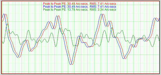
But could such a small shift cause PEC to be so poorly corrected? I say yes! To prove this theory I used the refine curve tab of PEMPro to try to reverse engineer the curve with PEC on (the one with 17.51 arc-secs PE).
In the graph below the blue curve is the PE curve with PEC off and the red curve is the exact same curve shifted right. I then created a new (green) curve with Subtract Curves, which is the difference of these curves. If the green curve looks like the 17.51 arc-second PE curve then it pretty much confirms that the residual PEC in the that 17.51 arc-sec curve was caused by a phase shift in the curve written to the mount.
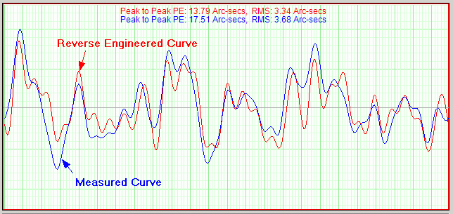
So, below is pictured the reverse engineered curve (green curve above, red below) on the same graph as the the 17.51 arc-sec measured curve (blue curve). They look very similar so phase shift was likely the culprit for the poor performance of the first curve. It is amazing what just 10-12 seconds of error does to the corrected PEC curve!
Conclusion
The reverse-engineered curve and the measured curve look very similar so I am comfortable with the determination that the reason for the poor performance of the original PEC curve was mostly due to the phase of the mount shifting before the curve was uploaded. It could be that the mount clock running too fast or that the PC was running too slow.
Whatever the reason, it can be corrected by phase shifting the curve then reloading the curve to the mount. Luckily this can be done without reacquiring data.
Furthermore it appears, at least in this particular telescope, that PEC playback appears to function properly.